Relation between interior and external temperature: Part 2
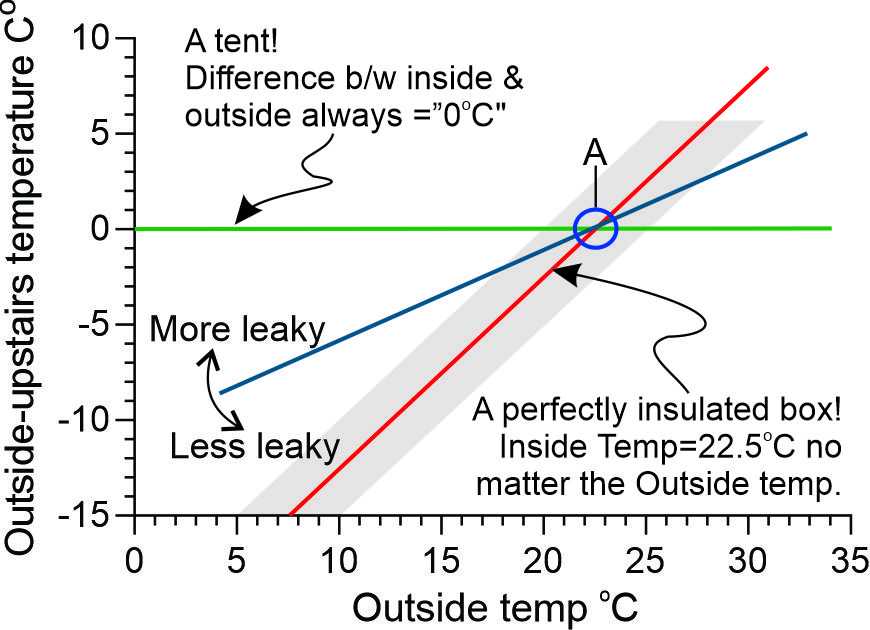
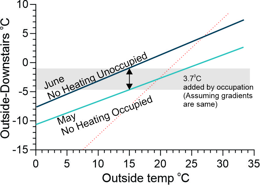
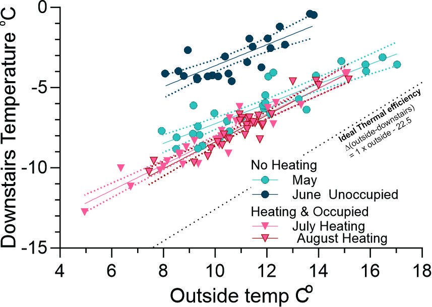
Figure 2 plots the regression line obtained from the data from Downstairs and Outside in May and June (full data shown in Figure 4). The dotted red line is the behaviour of an air tight house whose starting temperature was 22.5oC .
Plotting the Outside temperature against the difference (D) between Outside and Inside (DO-I) temperature can provide insights into the house’s thermal efficiency. Consider first a hypothetical example of a house that provided no thermal protection (a tent): in this case DO-I would be always zero because there is never any difference between Inside and Outside temperature (Figure 1). On the other hand, in a perfectly efficient house, the inside temperature would remain constant at (say) the chosen comfort level (22.5oC in Figure 1 and shown by the blue circle). The relevant formula is Y=aX+C, where Y=DO-I; X= Outside temperature; “a” represents the gradient (slope) and C the value of Y when X=0 (the Y axis intercept). In the “tent”, a=0 and in the perfectly efficient house, a=1 and C=-22.5 (assuming that 22.5oC is the ideal temperature). A key concept is that the closer “a “is to “1” the closer the house is to “perfect thermal efficiency”.
Downstairs data
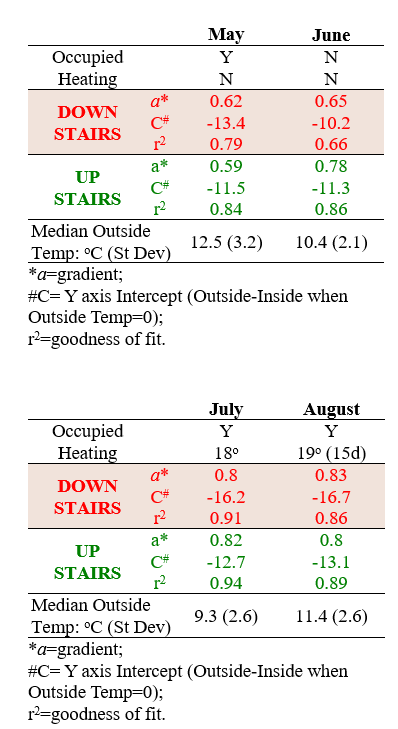
This relation between gradient (“a”) and “C” (the Y axis intercept) data from May, June, July and August was plotted. These months were selected because all were cold months (see table) and some had active heating (July, August), passive heating from bodies, cooking etc (May, June, August) or neither (June) - see table to right. The data for each day of these months is shown in Figure 2 along with the linear regression to show the average gradient (“a”) and Y intercept (“C”).
May v June analyses. The linear regression of these two months were plotted in Figure 3. The gradient (“a”) from the two months was effectively the same (ie the lines were almost in parallel). However at any particular Outside temperature, the difference between the two lines on the Y axis (Outside -inside) was 3.7oC: This is effectively the difference between their two “C” values. The most likely explanation is that the passive heating (bodies, cooking etc) provided this extra 3.7oC. While May was 2oC warmer than June, July was about 1oC colder and yet July was 3.8oC warmer at 15oC outside suggesting that the external temperature was not the explanation.
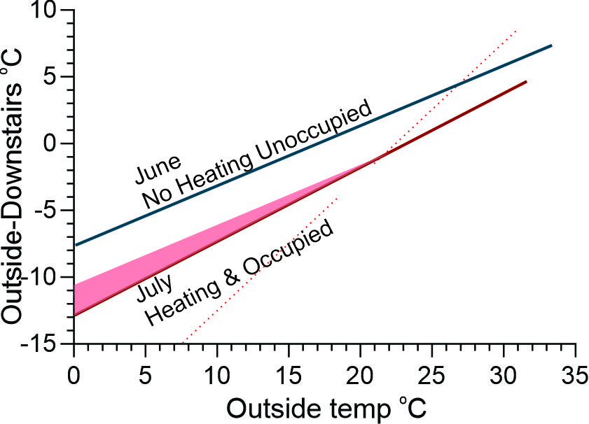
June v July and August; The gradient (“a”) from these two heated months was similar to each other, but steeper than May and June (both unheated months) (Table). Heating might be expected to progressively contribute the colder it is outside and has the effect of making the difference between inside and outside larger than if there was not heating: in other words it is as if the slope of the linear regression has been increased. Figure 3 has a shaded area, constructed to show this. Recall that it was suggested that the closer “a “is to “1” the more thermal efficient the house is: this statement is only true if there is no active heating.
Conclusions
- In a space that is only passively heated, the gradient (“a”) indicates the thermal efficiency of the space and the more negative the Y intercept (“C”), the greater the passive heating.
- Active heat increases the gradient (“a”) and also the “C”.
Upstairs
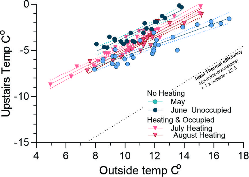
The Downstairs area behaves as a thermally stable area whereas the Upstairs are fluctuates far more: manifest for example by larger diurnal temperature variations. Upstairs is also the daily living area so there is more interest in heating to maintain daytime comfort. For both these reasons the gradients and Y intercept for the four months May-August are likely to behave differently to the Downstairs. The Difference between the external and Upstairs temperature for each of these months was plotted against the Outside temperature (Figure 5 and Table).
May. The Upstairs and Downstairs gradients are very similar, but the Y intercept (“C”) is smaller suggesting that about 2oC of the passive heat generated from living is being lost (e.g. through windows roof).
June: Differences between Upstairs and Downstairs gradients and C intercepts are probably due to small and can be treated as due to small data set.
July and August: Upstairs and Downstairs gradients are effectively the same but the “C” values (Y intercepts) Downstairs are about 3.5oC higher than Upstairs suggesting that Upstairs is losing more heat than Downstairs (e.g. through windows roof).
July compared to May. The July gradient is much steeper than May most likely due to added heating from the reverse cycle system. There is ~1.2oC in the Y intercept suggesting that heat loss (e.g. through windows roof) is mainly due to the higher temperatures inside when heated.
Considerations and Caveats
The contribution to the relationship from heating can be further assessed by considering power consumption and its relationship to heating (see later Blogs)
This analyses considers only heat losses and gains on cold months. Hot months will be examined in the next Blog.
In warmer days, taking strategic advantage of opening the windows to purge heat when the days is at its coolest is an advantage, but will likely change the slope of the graph as a reflection of reduced thermal “efficiency”.
